
Final Project Idea and proposal
The contextualisation of my project will be produced through the proception of beauty and what the modern-day society typically normalises as "beautiful". Society creates certain expectations of the perfect experiences such as photoshoots, expensive items and lavished parties with other “advanced citizens” so many individuals set high standards for themselves. According to modern day society, girls should walk and talk pretty, have perfect skin, and invest in makeup; they should watch their weight and keep up with the newest trends in fashion, my project will be a mixture of portrait and Fashion photography with more references from articles for example, “My size zero diet nightmare” By Louise Burke as well as “Plus sized models are fuelling obesity crisis” By Martin Bagot. This gives me the chance to experiment with something I have never tried before such as fashion photography, specifically editorial fashion as it is something, I have never experimented with though I find is aesthetically pleasing. In my opinion beauty has no definitive definition and should not be categorised by gender, facial features and especially not weight. Modern day society has brought out more anxious and depressive episodes in people's lives to a point where many may never be able to reach a point of self-acceptance. In some cases, I do think a person can reach self-acceptance when they, themselves, accept that they need the extra support in order to move forward.
During the formulisation process I aim to use the concept of coloured filters with defining hues and colourisations such as red, blue, green and purple to initialise the use of muted and unmuted tones. Naturally people use colour association to determine what someone is feeling in that moment or situation for example, red correlates to anger, green to greed or illness and sometimes jealousy, blue to sadness and purple to deviousness or mischief which is what I hope to achieve in my images. Furthering the connotations, the use of spotlights in my imagery will give its depth as well as a soft look in order to accentuate the image and centralise the subject by defining their facial features and clothing items. I will further the concept through editing in order to make it look like the cover of a magazine (vogue for example) in order to give the imagery definitive connotations sustaining an affective narrative. Being able to give an image a certain feel or aesthetic gives it personality that people can often correlate to this. Is important for my project as I want teenagers to have some form of emotional release or connection when viewing my work, this could also encourage other photographers in their experimental phases to use it in their own work. This isn't completely new to me as I have witnessed other students use them for backlighting techniques in their own work which was achieved with a spotlight. I will need a prolonged experimentation process in order to develop a steady technique to enhance my imagery. I am still however at an early stage in my project development with almost 6 months to complete my project, in between that time I will also be experimenting in the darkroom as well as an extended experimentation and evaluation process giving me the ability to properly get a hold of the base and structure of the project (planning and time management) I want to be able to have complete control over this and not allow myself to be consumed by the work load from this and other subjects, starting this early has given me a lot of opportunity to change my plans if needed.
During my Primary Research process I will focus on society’s typical normalisation of beauty and how this was centralised around weight loss and size zero models in the 1990’s up to its chaotic recognition in 2007 where most studios and magazines actually banned size zero models. I don’t plan on discussing deeply into the 17-year gap however I will address the influence and agony this inflicted at the start and how it was delt with in the end of the duration. The rest of my research however will be of photographers with strong portrait and fashion photography leads as well as the research of photographers that have experimented with pure colour photography. I am aware something similar is used in Matty Vogel's work with the famous teen idol Billie Eilish. I wanted to challenge myself and apply my skills to something out or my comfort zone this could help my project become more interesting and enjoyable for the newer generation. While using the filters and lights I hope to achieve in being able to give an image a certain feel or aesthetic That gives the image personality that people can often correlate to, that and the coloured filters look fun to use and could encourage others to experiment with them. This isn't completely new to me as I have witnessed other students use them for backlighting, . Typically, the imagery I want to achieve would be used for Social media building or a magazine article about fashion or photography depending on the final results.
The concluding aim for my project is to produce a series of well executed fashion portraits using coloured overlays in contextual order to better educate my target audience so that they have a deep understanding of studio lighting and the forms of photography produced.
Research
My reasearch has concluded that we live in an amazing digital age that has brought with it wonderful advantages in all aspects of people’s lives, but it has also created unexpected troubles, one of which is a detrimental change in society’s perception of beauty.
The bar for men and women has been set unrealistically high by the “role models” of today and numerous studies have revealed that the impact of social media on women could include an increase in negative or obsessive thoughts about appearance. Pressure on media also creates an environment where disordered thoughts and behaviours thrive and images of thinness are used to advertise the recipe for happiness referring back to size zero models in the 1990's and how that was a desirable shape for aspiring Hollywood models. Unfortunately, validation online can falsely fill the need for acceptance.
This universal feeling of acceptance is one that exists no matter one’s age, sex, or ethnicity. A lack of relationships or socializing naturally produces a desire to find a place where one is “accepted”. However, social media has a tendency to foster unreal relationships and can even make one feel more isolated and lonely then they originally were. This plays a large part in the development of mental illnesses and obsessive tendencies to change ones self for the "better" when in fact this is damaging them in all forms, society creates certain expectations of the perfect experiences and many individuals set high standards for themselves. When people are unable to live up to those standards, they can easily lose confidence in themselves or feel left out, which could have severe mental health issues such as anxiety or depression.
This kind of corruption I think is severally overlooked and ignored as social media has taken over majority of today. Men and women have been taught to compare themselves for most of their lives. There are signs everywhere, at every corner, flashing the words “you aren’t good enough” to every teenage girl and boy. No matter how much self confidence one possesses, it is almost impossible to ignore what society defines as beauty.
Size zero
Size zero was once considered a beauty episode in society although after models started to die from anorexia in 2006 many runways and magazines banned size zero models. In 2007 Louise Burke took part in an extreme dieting experiment. She lost a stone in weight, but her life became a nightmare. Her 'super skinny' experience was traumatizing for her and she said in an article she would never do it again. The plan was to diet to the extreme for ten weeks to see if she could reach the much talked-about – and sadly, much desired – size zero, and highlight any negative side effects. The first few weeks of the experiment were mainly eating healthy and exercising although she was eating 3 times a day like normal the bowls were limited to a ridiculous amount of 150 calories. The average intake range from 1,600 to 2,400 calories per day for adult women and 2,000 to 3,000 calories per day for adult men. The experiment only went down hill for this woman as she started to experience nausea on the second week but described not being able to be sick despite retching for five minuets-
The rest of the article highlights various sensitive subjects about her body and the overall infliction this diet had on her health as well as the negativity she endured in order to get through the experiment.
Celebrities like Nicole Richie, Victoria Beckham and Amy Winehouse were known for being size zero and for a time and were widely admired for it although no doubt they were roped into the social expectation. The images below were taken in 2007 and just by a visual representation of their arms you can see something is not quite right there. This idea of size zero is incredibly unnatural and almost fuels eating disorders and issues with weight gain. People shouldn't feel like they needed to undergo a size zero diet or participate in any form of extreme weight loss however society demanded it at the time no matter how horrific the impact on someone's mental health or physical health, it wasn't Widely cared about until more and more people started to talk about their illnesses and disorders from these kind of experiences as well as a growing death toll in size zero related situations.
Though here in the 21st century there is such thing as a plus sized model as well as social and mental healing which is one of the greatest things to be conducted for advertisement and awareness. The community don't widely condone in these sort of extremities that should have never been normalized in the first place. Plus size modelling is different from other divisions of modelling in the case that size matters more than exact measurements. Plus sized modelling has been a form for generations however it wasn't widely advertised or discussed in the community till the present. In 2018 an article was released by "experts" about the normalisation of plus sized models "fuelling" obesity crisis from a health prospective I can understand the disturbance however this incredibly irritating for strong believers in mind over body and that everyone has their own capability of thinking and the way this article presents itself was very negative almost as if plus sized people shouldn't come forward and feel comfortable with how they look or they way they live. I noticed that this was targeted against the plus sized community and the body positive movement for being comfortable with the weight they are. If anything the article is fuelling anxiety and depression in plus sized people and teens who are of weight again trying to encourage the average society's outlook on beauty and that weight matters. I found this incredibly disgusting and insensitive as being of weight in most cases is a medical condition or side effect of something medical. The article almost encouraged extreme weight loss.


Matty Vogel
Matty is best known for his concert shots in addition to traveling photography. Often focused on dark aesthetics and neon colour schemes, he shares his photography work with over 40,000 Instagram followers he also sells his own Adobe Lightroom prepackages which offers stylized contrasts and heavy lighting for different concerts and other live events. His Clients include Billie Eilish, Thirty Seconds To Mars, All Time Low, PVRIS, Hoodie Allen, & more. There isn't as much information on him as I would like there to be but his work and editorial photography are visually stunning, the way he uses dungy colours (red, deep blues and oranges) to darken his subjects facial features is brilliant he has beautiful contrast in his pieces. Matty Vogel is my main reference for my project purely because his work looks mildly professional and to me are an inspiration as I am a fan of his muses, specifically Billie Eilish who are in the images below.


Matty Vogel's imagery are visually stunning; the way he uses colour to capture the finer details and dramatize the facial features; the way his audience reacts to his images are the same way I want my audience to react to my images, I want the realisation and understanding that imperfections are acceptable and natural. The choice of colour also emphasize the features of the idol; within his photographs that i have displayed above the contrast between the idol and the background which bring out their true form and focuses the eye onto the subject matter directly which is idealistic for demonstrating the true beauty of the people he has photographed.
During his concert and photo shoots he captures the idols from many angles but the most effective in my opinion was when they stared directly into the camera lens it changes the aspect of the imagery because you can physically see in the persons eyes what they are emoting. Depending on the angle he has shot on varies the aspect of emotion through their eyes.


Harley Weir

Harley Weir shoots advertising campaigns and look books for major labels including Balenciaga, Céline, Stella McCartney and Jacquemus. She is known for her youth-focused fashion photography which challenges traditional attitudes to the female gaze through the intimacy of her images. Weir has shot covers for POP, Self Service and Wallpaper magazines. Despite being a relative newcomer, Weir’s fashion editorials have been featured in Another Magazine, British Vogue, CR Fashion Book, Dazed and Confused, i-D and Arena Homme+.
She graduated from Central St Martins College of Art and Design with a BA in Fine Art in 2010. It was here that Weir taught herself photography, experimenting with film and collage. Weir has said that her primary goal is to move people. “It doesn’t really matter what emotion it is really... It’s so difficult to move people,” she told Bullet magazine.


Mentions
Shelley Richmond
Shelley often travels around the world, taking part in various international projects. Her passion is photographing people in their natural environment, showing contrasts or harmony. Shelley loves adventures, so she is ready for all types of commercial or private photo shoots and other projects. I felt like she was worth mentioning as I think her floral portraits and fashion photography are beautifully composed and well excecated. I have also experimented with floral portraits and decided to include them in my portfolio though I hope to go back to them to experiment and improve this is also why I included shelly.
Brett Harkness
Brett Harkness works in a wide range of modern photography genres. Based in the UK, he takes portraits, lifestyle and wedding photos, as well as interior shots. He helps his models feel relaxed and confident which is incredibly important in the photography business if you need clients. As a result, they look attractive and natural both in the studio and in various locations. Brett believes that one of the best portrait photography ideas is to take pictures in a place where the person feels most comfortable which he is absolutely right in my opinion, if the subject doesn't feel comfortable it reflects massively in the work.

Shelley Richmond:


Brett Harkness:
Pre-Action Plan
Action Plan

Time plans for final major project
The action plan is a small quick plan for what I will be doing during the assignment pointing out the key aspects of what i need to produce my work.
Pre-planning is the lengthy in depth version of what I will be doing and when I will be doing them as well as what I will need from day to day in order to complete my my project as a whole.
The reason for this time plan is to complete key aspects of my project and to be able to produce work / hand in by suitable times, keeping everything in an orderly fashion for me to follow with ease.


Here are some examples of lighting set ups using gels. Some set ups are a 2 - 3 point lighting system where as few are just 2 point lighting systems. I plan to experiment with some of these systems in order to get a proper correlation into my own work, However I won't be using set ups over a 2 point systems.


Testshoot One


During my first photoshoot in the studio I was incredibly disappointed to have realized that in the second half of my shoot the lighting had not come out at all how I had planned. There was no clear division of colour on the models face which is the whole point of my project. I was not able to get sufficient photographs of my model I had desired for; I therefore reflect on my mistakes of not looking into colour theory and not looking further into what coloured gels I would have possibly needed for my shoot (I.e. primary coloured gels) or even researching into hues and contrast. I had thought that using orange and red gels might have made some clear divisions however I was mistaken.
I had discovered after my shoot that the lighting was tremendously off as well as my focus which was not ideal for my project because I wanted to extend the perspective of lighting and colour used in order to flatter my models, I wanted to get a Broader view on the aspect of emotion through the model's eyes.
Nonetheless I shall be re-shooting in the studio after I further my knowledge into colourisation; I will be able to get further detailed and more up-close photographs to really get the division of colour to then compliment and unappeal my models. this shoot helped me understand colour theory on a more physical level.

Here is my first set up you can see on the back drop that there is no clear division between the colours, the red mainly cancels out the orange in a displeasing tone. I took these images as reference on what not to do in future shoots I have planned. It took a lot of tampering with the intensity of the light because the intensity of the flash effected the exposure more then to what I Was expecting. Even then due to the colours I had chosen it still appeared over exposed which was irritating.


Continued Research
Colour Theory
A colour wheel is a convenient way of visualising the relationships between colours. The most common wheel used by painters is based on RYB colour system–where red, yellow, and blue are primary colours. When primary colours are mixed they makes something called secondary colours which are orange, green, and purple/lavander. This is important to my project as it is imperative I use complimentary colours on my models to, of course, compliment their overall features. For example if I was to shoot professionally and I used uncomplimentary colours which were to appear unpleasant in any way it would reflect harshly on my business and come across unprofessional.
However when you work in black and white all the colour information from a photograph has been removed. there is always a deliberate attempt where colour is a successful part in the composition and is integral to making it work, its not completely dependant on the colour however the colour really works in order to bring the composition together. Having control over the colour in order to make your images successful is said to be hard to do but once you grasp it, it feels natural.


Certain colours have different meaning associated with them, which will vary dependent on context. For example: red: caution, aggression, passion. orange: warmth, frustration, flamboyance. yellow: Confidence, hazard. Blue: intelligence, professionalism and depression. However, you need to be aware of colour association with sensitive topics, for example, political parties. The use of a particular colour can change the context of what you are presenting. In certain situations colour can be interpreted wrongly without explanation so its imperative that the situation can present itself with the colourful undertone.
Through my perception of colour association I have decided that the use of red and blue would better describe the newer generations in a sense that they're more angry and personally I would use the blue for a sad undertone which will create a purple background which is correlated to subtle deviousness. I believe this sits well with my projects topic with specificity to Negative mass media, COVID19 and the BLM (black lives matter) movement which all collided at once.
I have also looked at Aura Colour theory, each layer of your aura is said to be represented by a different color. Some believe that the way these colors vary and interact illustrates how emotionally, spiritually, and physically complex you are. For example, some layers may be brighter if you're more vibrant or have greater energy.
in 1970, Guy Coggins built a camera that could capture people’s auras, otherwise known as the electromagnetic field surrounding the body. There are supposedly about 100 of these cameras in existence, and one now belongs to Christina Lonsdale of Radiant Human, who goes on tour with her mini geodesic dome, photographing people’s radiant energy on Polaroid film. The portraits are stunning, strange, and so cool
Aura photography requires some special equipment, including an aura camera, two hand plates, a dark background, and a dark space to shoot in. The equipment itself can cost upwards of £16,000, so stepping into the aura imaging world takes commitment. Some artists work in permanent studios, but many aura photographers build mobile setups and travel around to host pop-up events at festivals, parties, and street fairs.
I would have seriously considered Aura photography if not for specific expensive equipment Because the photography produced is incredibly gorgeous. However, I feel like this was worth mentioning in my project in order to fully accentuate the point of light and colour in correlation to the newer generations having a more negative approach due to the pressure they're under regarding the more serious topics undergoing 2020 and 2021.

Testshoot Two


During my second experimental Photoshoot in the studio, I was incredibly worried at the start. There was a lot of over exposure and light spillage that I could not get a firm grasp on as well as some more focusing issues, this this did not last exceptionally long though, with some heavy light reading and set up repositioning I was able to get impeccably close to my initial idea for my final images. The process of testing colour gradients and the exposure triangle is also visible.
The ideal shots for this shoot started to appear at ISO 400, F5.6 and Aperture 1/2.5. The aim was to get the colours to appear separate on the model but to show a soft merge in the back ground which is shown brilliantly in the last image as there are hints of purple on the backdrop as well as red and blue. Through the process, the stages of over exposure are visibly cancelled out, but not fully, through the progression of the images. Off focusing is also visible through the images but that is due to me having unsteady hands as well as no glasses at the time however as my hands got steadier the focus evened out giving me some clear shots.
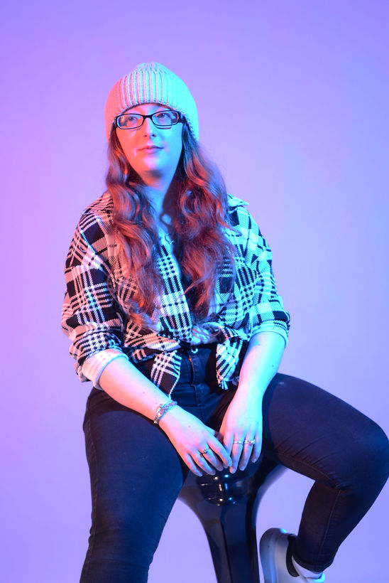

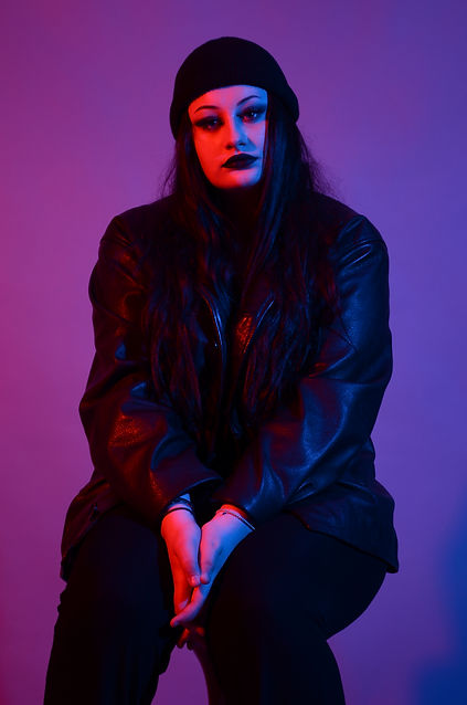
I decided to have an experiment with how I would want my photographs to appear in my final exhibition; Although this will not be in my final piece, I do however feel like the obvious over exposure makes the quality of the images less effective therefore I have decided to further this style by making the split of colour more definitive on the face and arms to really over exaggerate and darken the features of the model. In the image the lighting and gels gave a 3D glasses effect due to the split of colour between red and blue but it also incredibly highlights the forearm and facial areas of the model. According to the colour wheel blue and red are very complimentary therefore the backdrop has been tainted a lilac purple.
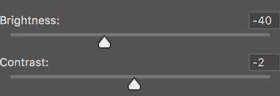
The idea of using softer light was an excellent approach in terms of softening the model's facial features however that isn't the approach I wanted to convey in the slightest, it doesn't get my initial point across even with heavy editing. Above are adjustments that I have done to the image already which are brightness and contrast as well as the channel mixer (Red, Green and Blue). The reason there is not much change in contrast is because the original image was near perfectly contrasted. As for brightness there was some slight over exposure that was somewhat fixable during the editorial period.
Over all I am quite happy with how my experimental photoshoot was executed. All the imagery turned out better then I planned for, I think that this has better prepared me for my actual photoshoot.
More test shots


Despite the fact I have chosen and edited these images as examples, they are still out of focus which is quite worrisome when it comes to my proper photoshoot. I want to have roughly 4 crystal clear shots ready for my exhibition and my portfolio. To counteract the unsteadiness I have heard of some breathing techniques to help steady your hands. To improve this further I will wear my glasses for the actual photoshoot.
This is a prime example of the idealistic set up. I finally managed to get the set up right and it be visible on the background. However, in the test shoot the blue came out muted instead of deep as well as the red not being a searing red which was disappointing, Not enough to deter me from using this set up though, I will have to further practice with the lighting systems. With some minor adjustments this set up could be perfect. I kept the lighting the same way as my first shoot, thats why there is no set up difference between the fist lighting set up and this one.
.jpg)


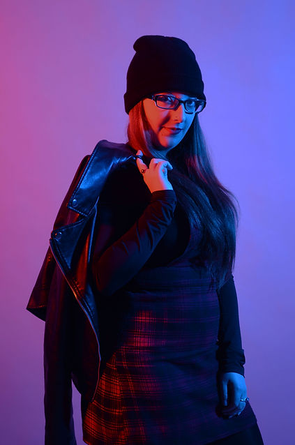
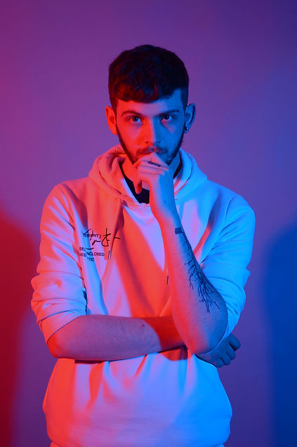
FINAL MAJOR PROJECT OUTCOME

_JPG.jpg)
_JPG.jpg)
_JPG.jpg)
_JPG.jpg)
_JPG.jpg)
_JPG.jpg)
Behind the scenes
The images above were conducted in this exact set up. Personally I am proud of how this shoot came out, It couldn't have gone any better than this. I managed to get shots of all my models individually, it didn't feel rushed. There wasn't much difference between the set ups other than the lighting hue which did end up showing the red prominently however I am not phased by this in any way. The fact that the colours aren't visible on the backdrop docent bother me as much, this is due to the exposure again and having to tamper with the lighting on the light themselves in order to make the flash less intense and get a decent balance of colour.


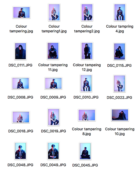
contact sheet for FMP from studio


Here is the larger contact sheet from my FMP photoshoot which collectively is made up of 110 images. I will be examining these images and choosing which ones I see fit to potentialy be part of my final set of images.

contact sheet for FMP, FINAL SELECTION
These are the photographs in which I have chosen for my potential final pieces; I will be examining which are the greatest quality out of each photograph and analysing what fits my concept and out of 34 images shown I will be picking 4 to be presented in my exhibition.
This will be based on clear focusing and colour variation due to me having exposure and focus problems in past shoots which negativly effected my work and confidence. However, I do feel like I have improved tremendously in the past year in consideration to the world wide pandemic, my attention to work as doubled as well as project planning which was a big struggle at the end of last year.
Final Piece - Edited
_JPG.jpg)
_JPG.jpg)
.jpg)
Evaluation
The conceptualisation of my project is substantial to what I originally planned; the achievement of my narrative is clearly noticeable through my images there for my project openly demonstrates the use of colour association and theory in correlation to the newer generations. The representation of my photography against the subject matter a noticeable impact on how newer generations hyper focus on the proception of beauty and what the modern-day society typically normalises as "beautiful" however, this is a competing factor in a wider spectrum of issues that have surfaced since the year 2000 without going into immense detail. My photography are the symbolisations of irritation and the attempt of rebellion against the mass media with clear colour association connotations.
The strength throughout my Final Major Project consists within my final pieces; My photographs capture dynamic and detailed perspectives of each individual model portrayed. The colours used centralise features of the models therefor I confirm that the project I have produced connects with the perception of beauty and how the media proception of beauty and what modern-day society typically normalises as "beautiful" as well as promoting vital emotive atmosphere to my audience. I decided to shoot my photographs on a D5200 Nikon camera (18 – 55mm lens). This camera supported me in the finalisation of all my photoshoots as well as producing defined and detailed close ups of all my models. I believe by using this camera compared to my personal one (I have had issues with it in the past), There is a noticeable quality increase throughout my project which, as an outcome, produced a stunning series of immaculate and colourful images.
The areas for development in my project are to be wary of my action plan, I noticed that I have gone through my pre-action plan without fail however I failed to set up a survey in order to support my point with outside information, which had not been what I intended at all. However, I was able to make up for it in doubled research, however I feel this may take a toll on my final grade. If I had the opportunity to do my project again, I would consider experimenting with other complimentary colours and association as well as varied styles of fashion, such as pant suits and dress gowns for an elegant take on fashion, this would have been an intense contrast in comparison to my actual project as the styles are opposites. I believe this would be a remarkably interesting concept to develop further as it can be linked in as a correlation and development phase to this project.
In my perspective I believe my project could have been further developed if I had followed through with the original plan of using some form of survey or interactive public poll as a way to consume more information and uncovered serious subject matters in further development to the bases of my project and the effecting areas in the communities. I am aware that the main aspect of my project should have been supported through this method of research. However, I believe I have more than supported my point with the much extensive research I have discussed, highlighting important social issues that should or have been addressed in the past which has built up these disgustingly elevated expectations of young adults and teens as well as the numerous mentions of global issues such as Covid-19 and the Black Lives Matter movement.
The adaptation of not correlating to a magazine cover was an idealistic choice to make because my audience would not have gotten the full extent of my intentions with prominent colours in relation to feeling and focused solely on the bold lettering and information. I believe If I had followed through with the initial plan to make four well executed magazine covers it would have ruined my images and destroyed the concept of my narrative.
In conclusion I personally finalise that my project’s overall outcome still achieved what I originally wanted it to convey with some minor irritation of making small adjustments and changes to my project especially with the decision of completely excluding the production of a series of magazine covers and experimenting with cover designs. Nonetheless I believe my project worked out for the better and that my narrative held strong. I am incredibly satisfied with my initial outcome with the support of my images that clearly demonstrate the frustration of the newer generations.