
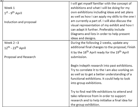
Exhibition proposal
An exhibition is a shared space therefore the whole experience is shared. As a collective of photographers there are bound to be some assertive or dominant opinions, individually it is our right to voice them, however for the exhibition to be functional there must be some common understandings for it to be aesthetically pleasing as well as compliment the imagery separately to please the audience. Overall, the aim of my exhibition is to stimulate the audience into acknowledging the damage society has done to individuality and the perception of beauty which not only afflicts people's mental health but what we think about ourselves. During the formalisation process the perspective of the exhibition will be displayed through a Black and White concept this is to complement the sequences and characterise the definitive connotations trailing through the individual images as well as to not make the exhibition look overly complex. After much consideration I will not overcomplicate my exhibit, however I will still include the idea as a part of my formalisation planning.
I intend to accomplish this by applying methodical research into the concept of coloured filters with defining hues and colourisation such as red, blue, green, orange, and yellow to initialise the use of muted and unmuted tones and incorporate this from my FMP into my exhibition. The ideal process of my images is to revolve around vibrant colours as a result I had thought about pushing forward a signature colour to be added to the groups individual exhibits (of course this would be completely optional). This could further complement the imagery shown. This is also to link the exhibition to the photographs displayed.
Violet or a deep purple is what I would incorporate into my exhibition because purple is the secondary colour to blue and red in which my imagery will have harsh blue and red lighting. For my sector of the exhibition, I would have liked to have white walls with a black border to make the imagery stand apart from the wall however to incorporate the purple I plan to use purple paper and have the corners of the images just overlap, that way the purple looks part of the wall without having to use paint. However, without using any colour I still want to include the black border instead of frames as another account of affordability.
This is how I pictured the layout to look. However, I would have adapted this further by experimenting with different shapes; for example, triangles or smaller squares to further my exhibition. This was a personal observation rather than an initial understanding of my target audience. In order to appeal to my target audience, I will try to incorporate some interaction with the public as a way to develop a better understanding of what applies in which aspect to intrigue the audience. A survey would be best in order to interact with audience that way I can use questions asking their opinions and what they would do or would like to see.
The concluding aim for my photographs is to have four portrait images (A2 size) to produce a high narrative and effective imagery that informs my audience and enhances my exhibition, this would be beneficial for my target audience because upon viewing A3 in person its smaller and not as eye catching where as in A2 its larger and eye-catching but also not too overpowering enough for my exhibit. The photographs will portray the same narrative through the visualisation of individual beauty; this will incorporate close ups of different people to get a broader horizon of the impact visually and emotionally. Unfortunately, on account of affordability the exhibition group has decided to cut down the number of images in order to benefit everyone included. In conclusion I will only have four clear shots to present.
To make my real-life exhibit more intriguing, I thought about borrowing a mannequin from the arts department to present a typical “grunge”. This is efficient in utilising empty space as well as to use this fashion style as it presents itself as subtly angry and rebellious towards other popular styles. This look will include; a leather jacket, Metallica band T-shirt, skater skirt and some platform boots. This is an outfit I own myself as I am particularly fond of this style. Using a mannequin could immensely boost my exhibit as it adds some extra dimension and detail to my exhibit as well as visually stimulates the audience to either better deliver the point of the images or to educate them further on the project. This is further supported by my target audience through I survey I conducted that shows clear indication toward props and 3D definition.
In order to fulfil everything needed to be done for the exhibition everyone involved will be given individual tasks. This is ranged from social media pages arrangements to promotional materials like posters and leaflets. This is incredibly beneficial for the group as it could bring about heavy communication that was not present before. Due to this heavy communication, we should be able to decide upon an official name for our exhibition.
Due to Covid-19 there will also be an online exhibition available to the public, advertised online as well as posters including QR codes for people to scan, this is beneficial for everyone involved, it keeps the audience safe as well as the group safe. Just like in my real-life exhibition I intend to use the same 4 images as the real-life exhibition so that the online viewers have to same kind of stimulation as the ones potentially attending to the real-life one. However, I feel like the online exhibition is limited via resources and does not leave a lot to the imagination this makes the exhibition less effective in terms of alluring my target audience and giving them the full experience. Whereas in the real-life exhibition you are given the ability to be more creative and resourceful which allows you more freedom and interaction with the exhibition group.
The concluding aim for my project is to produce a well-executed exhibit using 3D objects to give my exhibition more dimension and visual stimulation which gives more insight on modern “grunge” fashion in context, I plan to have small, mounted bits of information and feedback notes as another form of interaction.


Exhibition Planning & Research
The Mosaic rooms By Heba Y. Amin
Amin is a multi-media artist from Egypt. She works with political themes and archival history, using mediums including film, photography, archival material, lecture performance and installation. Amin teaches at Bard College Berlin, is a doctorate fellow in art history at Freie Universität, and a current Field of Vision fellow in New York. She is the co-founder of the Black Athena Collective, curator of visual art for the MIZNA journal, and co-curator for the biennial residency program DEFAULT with Ramdom Association.
Amin investigates how politics and events in the Middle East relate to global concerns, challenging colonialist narratives of conquest and control, while also exploring the totalitarian exploitation of technology. Her research-based multimedia works take speculative, and sometimes satirical, approaches to these ideas.
Alongside performances and interventions, Amin’s research integrates film, photography, and digital technology to think through present-day issues and the potential significance of occluded stories and previously overlooked archive material. The research incorporated in these works will be added to by the artist as the show unfolds. Amin is aiming her work at news reporters and historians and other photographers surly because of the topic of her work. This strikes her target audience and intrigues them based on the medians she has used as well as the overall 1800's feel which is present in her images as well as the minimalism of her exhibit. Based on her audience she has successfully met their needs in the construction and execution of her exhibition with the similar connotations through her final images, as her images have a 1800's feel this links back to her audience and their interests towards historical and informative imagery.

Personally I found this immensely intriguing purely because of its abnormality. The subject matter of the images is just alluring and unusual that draws the audience in. If I was to take something from her exhibit and interpretative it into my own it would be the minimalism she utilises, with intricate frames to make the audience really take a good look.
Heba's exhibition and her incorporation of colour from her images and the colour of the walls really presented itself to me in a positive way, this shows she has intricately linked her images to her scenery through the use of shades and hues of pink this carefully creates a dimension that attracts you, in order to separate the images from the wall.
In 2013, Egyptian authorities detained a migratory stork for espionage. This incident is the focus of Heba Y. Amin’s The General’s Stork, an ongoing project that investigates the politics of aerial surveillance—against the backdrop of biblical prophecies, drone warfare, and colonial narratives—from a bird’s-eye view. The research that informs The General’s Stork looks at how conquest from the sky—through land surveying, mapping, bombing, and drone technologies—has effectively transformed Western power into a spectacle of high-tech weaponry.
Decisive Moment, London 2021

It’s a photo exhibition that puts together various styles of photography proposed by very different artist.
Each photographer has followed a different path from one another, each has his own history and each has a different perspective on life, but all have in common the ability to grasp the suspended and decisive moment.
The Decisive Moment is what occurs when the visual and psychological elements of people briefly meet in perfect resonance, expressing the essence of that situation. ‘The Decisive Moment’ also happens as the photographer decides to raise their camera, compose the frame and press the button… click. Each photographer follows a different path, each has their own story and a different way of looking at life, but what they all have in common is what we define as the suspended moment.
The Decisive Moment is a photographic exhibition that tells of this suspended moment, that apnea held by the photographer. The exhibition, organised by agency Art Full Frame, brings together photographers from across the globe, each with the desire to share their unique vision of reality. ‘The Decisive Moment’ is a collection of stories, presented in different styles. In some images, colour will be the protagonist of the story, whilst in others the story will live through the drama of black and white.
I will be including some photographers and their work that I have taken an interest to. This leaves a lot to the imagination and creates a larger target audience based on the range of different photographers present in the exhibition.
This image belongs to Monika Blanka Katterwe, from Germany, Since 2016 she has been working as an artistic-scientific photographer. The basis is nature observations, experiments and studies of scientific literature. Using her many years of experience and knowledge in the interdisciplinary project work, she deals more intensively with the nature and the characteristics of light in her independent activity.
This is incredibly interesting as her work is mainly black and whit however there is some light colour pop that makes the imagery more alluring, she has used specific colours to really appeal to her target audience. Based on her imagery her target audience could be interested in freelance or building. based on her audience she has successfully allured them twards her work using the colour pop technique.
If I was to take something from this and incorporate it into my own work it would defiantly be the use of colour pop. I think this would be beneficial in supporting my imagery and FMP research this is due to the subject being fully coloured but the background being black and white, I feel like that could have added more depth to my images however I'm content with how they came out.
Born in Finland, studied at London College of Printing and Royal College of Art, lives and works in London and Helsinki. Has taught photography and contextual studies for several years and worked as an artist tutor on many community-based programmes.
Memory, reliving and re-enactment form an important part of their personal visual practice. She explores and retell stories that have been passed down, giving importance to events that she feels a connection to through the experience of others.
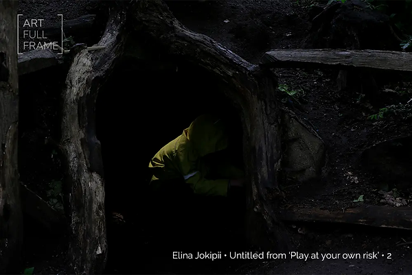
The series ‘Play at your own risk’ was inspired by a sign in an inner London playground where she her children indeed have played at their own risk. Play can be seen through adult eyes as being full of danger and risk; it is seen as an anomaly in the human existence, something we grow out of very quickly as we get older. Elina expresses her deep worry for her children through her photography but also as a way to inform other parents, clearly indicating that her target audience are mainly worried parents and mothers which really affiliates and contributes to her work as it presents a sense of dread and worry when a child is exposed to certain situations. I wouldn't be able to incorporate anything from their work into my own I have no conveyance of danger or dread throughout my FMP or my exhibit. I also have no experience with children or the dangerous situations hey can be exposed to.

Oriel Gallery exhibition (2021)


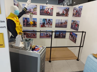
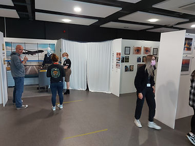
This is a real life exhibition the group had a chance of visiting, Conveniently it was on collage grounds at the Oriel Gallery. This exhibition was put together brilliantly by the Grimsby university photography class. Personally i thought all of these exhibits were remarkable.
Visiting this really helped me get a hold of the visual representation and effect it can have on the audience and only helped the formulisation and the initiation of my own planning in the motion.
My Audience / Survey
As a way to interact with my audience I put together a free survey on google forms and advertised it on my social media pages. I wanted to ask opinionated questions as a way to get a better understanding of how my audience thinks. This has proven to be incredibly effective and interesting to see the diversity in opinions as the responses started to come in.
Below are the questions I composed on the survey, I wanted to have a mixture of multiple choice and individual answers questions to really promote the interactional factor as well as to see how different people responded. I utilised these questions to also further support my initial idea of using a mannequin without actually saying that I'm using one the responses came back interesting and diverse but surprisingly supportive.
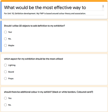
The images above the untouched layout and questions so that what the audience saw whilst filling in the questions is available.
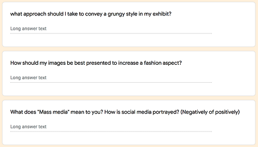
The answers from the opinion questions came back incredibly interesting and effective towards my exhibition. What did strike out to me was the answer for "mass Media". In my FMP I conducted research on how social media is used negatively and how this has an effect on society and the answers three out of 5 answered have drastically supported that hypothesis. this makes the work I have done so far incredibly important in challenging the typical normality that is social media.
Aside from them responses, The survey has proven to be successful in highlighting my initial idea. I will continue to use a mannequin and minimalistic techniques as far as my imagery goes in order to provide a better stimulating experience for my audience interested in clothing and grunge fashion. To further this experience I will keep the idea of additional information being placed near my images and the clothing being presented.


The reasonable responses to these questions on my survey have helped my initialise my final idea further by excluding the use of coloured card or paper. In order to promote and allure the audience towards my exhibit I plan to only utilise the mannequin and show stand as a way of promotion towards my audience, I feel like this wouldn't over power the point I'm trying to make where as the additional patterns and colour will therefor the idea is to keep it minimalistic but aesthetically pleasing.


Time Plans and Pre Planning
Action plan
.png)
Pre-Action plan
.png)
.png)
Tasks
Task assignments were not to difficult to assign, the Collection is a small exhibition group so to every task their was a pair. As part of my individual task, I manage the social media platform (Instagram). This includes uploading Posters with exhibition dates, Exhibition updates as well as Uploading peoples work separately with a statement submitted by the members as insight on their projects. For the individual caption I go everyone who submitted work to send a small paragraph including what their individual projects are about. In my opinion this was absolutely necessary as it opens up the narrative for people looking in to understand their imagery.
I thought this would be an interesting strategy to encourage people into supporting our page and in hopes to lure people towards following our progression as a team with updates nearer to the exhibition dates. To further the page, I plan to develop story highlights on individual pieces of work with behind the scenes of photoshoots as well as the construction of each exhibit nearer to the exhibition dates.
On the Instagram page there is a logo designed by a member of ‘The Collection’ Team. The collection is the name of the exhibition which was decided upon by the group. There was no initial target audience for the instagram page as it is made up of many peoples work therefor it being available to a range of audiences.

.jpg)
Below are some of the logo designs made by a member of the collection. The group was given a choice between the three. All of us decided on the first on as it is aesthetically pleasing to look at.


Equipment
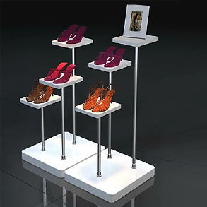
For my exhibit the main sources of equipment are a mannequin and a plain white stand, these are both to be used for display purposes as I initially want to display the typical grunge style of clothing as well as present a set of platform shoes. This will give my audience a really iconic fashion advertisement/display like feel as my subjects in my images presented will typically be underlined by their style in clothing.
To display this it wont cost me additionally as it is being provided for me through collage resources however, if I was to display this as a personal exhibit in a art display, Mannequins and shoe stands collectively can cost anywhere between £150 - £300


Costing
As far as costing goes there is a lot to cover. firstly I have decided to use A2 instead of A3 specifically due to the fact that A3 looks a lot smaller than I first anticipated. Costing £8 per A2 print, for all 4 prints that amounts to £32.
.jpg)

Art steps and The Oriel Gallery
As COVId-19 as a dominating factor of today we have had to adapt to life online as a way of work and communication, This includes exhibitions and works of art foe those in artistic jobs and educational curriculums. Here is The groups exhibition on Art steps. Art steps is an editor that creates virtual worlds to help Showcase your work in VR. Due to this being a group online exhibition we all required the log in and password. It was incredibly beneficial to have a group email, this mad setting up art steps and social media platforms in order to promote both exhibitions (online and real life).
In terms of the audience because its online this docent specify to one particular group, it is expanded which is interesting. Its intreguing to know that more then one group of people are observing and taking in your work.
Art steps is quite helpful however it is incredibly glitchy and caused the exhibition group to almost lose all the work they had done. luckily it was just a glitch and the program was up and running again soon after. This docent dismiss the fact that it had glitched and has raised a few concerns amongst the group as to how it will operate during the online exhibition. As a primary factor we can't afford to lose any work because of this in conclusion to the amount of effort put into it by the group. I believe that the glitch was only present because there was so many people using it at once.
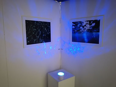
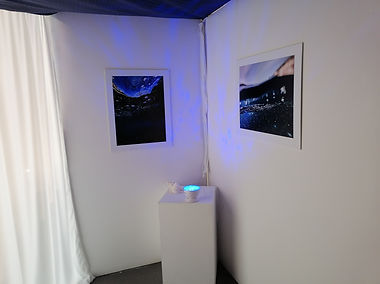
The images to the right are the initial set up of the online exhibition. This was a pre-made set up which was convenient for time management as well as a relief of work pressure. Due to everyone being at different stages in their final major project we worked under a "first come, first served" bases which was convenient for everyone involved in the end. There was no disagreements towards these standards as it benefited everyone.
lastly to the left are my series of images. During the formalisation of the online exhibition I did struggle with proportions and sizes as I was not familiar with the platform . It was over all confusing for me however, I eventually got there with it.
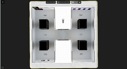


This is a to scale space of what we are using for our real-life exhibition. these cubicles are what our initial set ups will be held in. I have come up with a rough sketch of the initial layout and placements for everything featured in my exhibition. The initial sketch is featured below:

Evaluation
The conceptualisation of my project is substantial to what I originally planned; the achievement of my narrative is clearly noticeable through my exhibition there for my exhibit will openly demonstrates the use of colour association and theory in correlation to the newer generations through the images i have chosen to display. The representation of my exhibition against the subject matter shows a noticeable impact on how newer generations present themselves through the use of clothing and what the modern-day society typically normalises as "fashionable" this will be displayed through the use of a mannequin and clothing items that are widely seen as "grungy" and "rebellious". My real-life exhibit will symbolise irritation and the attempt of rebellion against the mass media with clear associated connotations to the use of colour and feelings.
The online exhibition, using Art steps, Is just like I will in my real-life exhibition. I have used the exact same 4 images to the proposed real-life exhibition so that the online viewers have to same kind of stimulation as the ones potentially attending to the real-life one. However, I still feel like the online exhibition is limited via resources and does not leave a lot to the imagination whereas in the real-life exhibition I will have given it my all-in order to match my target audience and the ability to be more creative and resourceful is available which allows me more freedom and interaction with the exhibition group.
The strength throughout the steady construction of my exhibition consists within my initial idea; The clothing will be displayed strongly on a mannequin as well as a set of shoes I believe using the mannequin will deliver the point I am trying to make to my target audience in a sense that clothing can implicate feelings. As for the shoe stand that is for additional support via clothing. I don’t intend to use coloured paper to mount and give my images dimension, this was a futile attempt of generating ideas however it did lead to more developed and sturdier plan. This was further supported by a survey I conducted which was a way to interact with my audience to specify which audience I have and what their opinions and observational preferences were like, this helped me to understand and reveal my audience to be between the ages of 17 and 20+.
The colours used in my FMP imagery centralise facial features therefor I confirm that the project I have produced connects with the perception of beauty and how the medias proception of beauty to what modern-day society typically normalises as "beautiful" linking bac to my exhibition this provides vital emotive atmosphere to my audience through the use of an interactive experience via photoshoot opportunities in my exhibition giving the audience a chance to feel like a model.
The areas for development in my project are to be wary of art steps, I noticed that the editor could become glitchy and cause the exhibitions to almost lose all the work they had done. luckily it is just a matter of waiting for the program to sort itself out. through my experience the program was up and running again soon after. This doesn't dismiss the issue. However, as a member of the group, I have high concerns that the program will crash and lose all the work that was placed in the online exhibition. If I had the opportunity to do this again, I would completely flip the concept and pursue a deeper gothic take through the exhibition by utilising sound and sight to the extreme for example, use black sheets or paint to make the setting darker to accentuate my images, as well as use lighting strips below my images to give a more sinister approach to my FMP work.
In my perspective I could have put in additional effort for the online exhibition to make it more stimulating and appealing in comparison the real-life exhibition which reflects on my images. However, believe I have more than supported my point with the much extensive research I have discussed, highlighting important social issues that should or have been addressed in the past which has built up these disgustingly elevated expectations of young adults and teens as well as the numerous mentions of global issues specifically Covid-19 in which we have had to work around.
In conclusion I personally finalise that my exhibits overall outcome still achieved what I originally wanted it to convey with some minor irritation of making small adjustments and changes to my exhibit especially with the decision of completely excluding the experimentation of coloured borders and external shapes and pattens which was proposed to make my exhibit more alluring. Nonetheless I believe my exhibit will work out for the better and that my narrative held strong. I am incredibly satisfied with my initial outcome of the idea with the support of my images that clearly demonstrate the frustration of the newer generations.